Etrex 20 Review
At 12 years, the old one has seen better days.
As a long time user of the original yellow etrex, here is some thoughts on my experience using the new model. As there are already heaps of this-is-what-it-does/i-really-like-it kind of reviews that arent much help to hard core purchasers, I'm going to focus more on the tricky stuff.
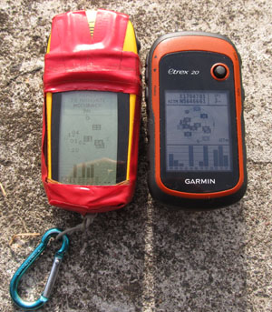
For its time, the original yellow etrex was widely viewed as a good piece of industrial design. A cheap but capable compact consumer gps, waterproof, long battery life and a UI that was elegant in its simplicity. The new model appears to be most of those things as well. But now its also been brought somewhat into the color screen, mapping, icon driven menu world, traditionally the domain of more upmarket gps units.
First off the case design. The case appears in general to be smaller, the height being 15mm less, but about the same width and depth. However the new model feels just plain chubby, which is a product of the tapered back, and the real estate the new accessory mount takes up. For tramping use the accessory mount is of zero use, unless you count the carbiner clip. But thats overkill as the new model retains the (fairly petite) lanyard mount on the lower edge. I will note that while the etrex yellow was made of decently strong plastic, the lanyard mount does eventually break if you use it to secure the device to your pack. The original etrex rubber rand also tended to debond after several years, and i do note that the new case appears to use a more modern bonding system. However the back cover seems more fragile, and i personally i wouldnt go mounting the thing on say bike handlebars. That just seems to be applying forces to the back cover that its tiny locking connector dont seem to be engineered to withstand for any period. Sorry, but thats how i see it.
The screen is about the same size, but squarer (34mmx42mm cf 30x60mm). However its a 2.5 times higher resolution at 128 x160px cf 64x128px. The contrast on the orginal was pretty awsome. On the new one, the backlight is definately required for indoor use, however, at the cost of washed out colors, the transflective color screen is suprisingly readable in sunlight without the backlight. In fact the backlight makes little difference outdoors, just a little more contrast. Fonts, lines and icons are nicely rendered, and antialiased throughout.
The battery compartment suffers from the same overly tight fit enjoyed by the original. Im not sure if NiMHs are just longer than usual, or they just felt the need to really skimp on space there. However i will note that the battery terminals look significantly better quality. The original did have a tendency to break there.
The side buttons have lost the distinct raised tactile shape which allowed you easily locate them with gloves on. This reminds me of a farmer i met whose new hilux was lower to the ground and who muttered that the wretched thing was designed for townies.
Now for the biggest physical design issue. The original was designed to be held and operated in your left hand. This is partly because, being a non mapping gps, you would hold the map in your right hand. A whole generation of outdoor users quickly adapted to this mode of operation. It makes a kind of sense when you think of it this way: that your primary hand is left free to do your primary task whatever that may be. Now the new etrex maintains the exact same set of left and right edge buttons. As you know there are three buttons on the left side quite closely spaced. Up, down and submenu. The only real way to push these before and now, is with your left thumb.
So what's changed... the click stick which Garmin in their wisdom decided to put on the right hand side, to be used with the right thumb. Im have no idea what they were thinking. You end up using it in both hands depending on what you are doing.
The click stick is fairly responsive, but only operates up down left right mode, theres no diaganals. Other than its placement, its major flaw is that like most such devices its use as the OK button is ultimately let down by the high mis-click rate. If you dont hit it fair and square in the middle, it will click but not register and this happens for me about 10% of the time, which is not that great.
The up down buttons are now mainly used for zoom in and zoom out, and also go to top or bottom of lists. Curiously they chose the top button to be zoom out. I instrinctively would have gone the other way. The right button mainly for back/cancel. Power button shows a nice date, time, battery indicator, plus backlight controls.
The new menu system despite being full of dross out of the box, works well because you can reorder/remove the icons to your hearts content, and best of all you can tell it which pages to put on the right menu button, and in which order. I really like that. Here its: map, compass, menu. Thats nice. Note that if you put a page on the right click menu it will not show on the main icon menu. This struck me as odd at first, but ive learned to live with it. My view is it would be better if they werent hidden.
My main complaint about the icon menu is that they used the exact same layout styling for the setup and one or two other submenus, and this is confusing. If the second tier was a plain list it would better distinguish the main menu from other menus.
Theres one or two other related quirks to the UI. In general, the left menu button will reveal a context type menu on many pages (its no longer used for OK). Some times it will just say no options. In the new icon world there are many "user friendly" buttons like 'where to', 'man over board' etc which arent really needed. But they have in essence implemented a noun verb, verb noun UI, which does allow you to work which ever way suits you. For example you can do either of: waypoint, navigate; or navigate, waypoint.Personally ive got used to the old (former) way and that still works just fine. Mapping has added some complexity to what was previously a simple UI. For instance you can on the map screen click stick around to a place on the map, and create a waypoint there. Its not overly intuitive, but you move the pointer to the spot, then ok stick click, then left menu, add waypoint. I would have prefered the add waypoint button to be on the first ok screen. It seems like something you might do quite a bit. The alternative is mark waypoint, left menu, move waypoint. That feels less direct, but for some poeple it will make sense i guess. Similarly trackback is achieved by the tiki tour of track manager, view map, left menu, review, trackback. Please garmin, dont hide those common tasks in the left menu, put them on the main list of page options.
Waypoints have lost any kind of categorisation. The original etrex used A-C, D-F type groupings that while not ideal worked. Now they are all in one big list. However you can sort them either alphabetically, or by proximity, or you can search for points by partial name, (letters anywhere in the name, not starting letters). Me i ideally would prefer to be able to group them by park. In the old etrex world i used a system of first letter for park name, eg T for Tongarairo NP, then H for hut, then the remaining 4 letters for the hut name OTUR, cryptic but workable. I am not sure what i will do now.
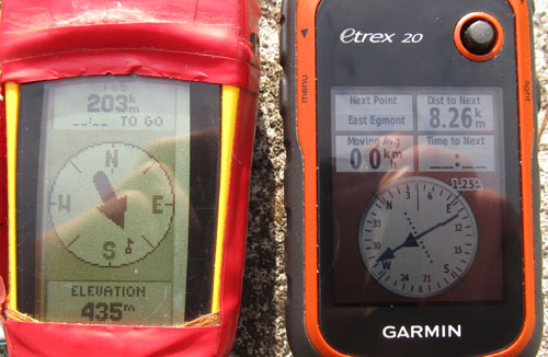
Backlight off, outdoors in full sun. Note how it now takes 3 datafields to achieve the old etrex top leg info box
Lastly on the UI, the datafields are kind of neat, because you show any of them on either the map or compass screen, in various size configurations. But for hard core users, all you need is elevation, location, distance and time to next. Having the labels for each field takes up screen space that coud be used for other things, in some cases. Cant please everyone there i guess. The compass screen has a new course deviation indicator which i think will be useful. The datafields also distinguish between stopped and moving when it comes to measuring time and speed. Thats something we all wanted on the original for a very long time. But with sat jitter and all, we will have to wait and see how well it works in practice.
Documentation. The included and online manuals are frankly not that great. I was really surprised that a reputable manufacturer could produce such mediochre manuals. Its one of those what-this-button-does kind of manuals that doesnt tell you how to achieve things. I read it cover to cover, but didnt really have the UI tamed until after playing around with the unit for a good wee bit.
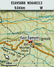
4.2m Raster topo
Same applies to getting up to speed with garmin software. The unit has a mini b usb port, interestingly accessible outside the waterproof battery cover, covered by nothing more than a rubber dust cap. If you get the unit wet, you must thoroughly dry it before using the usb port. But, other than the mapping, the usb is the best new feature. The old etrex had the univerisally hated propretary connector, which was an addon that cost half as much as the gps. Anyway, going to the garmin site theres no clear explanation about the different overlapping garmin software. In brief i discovered by trial and error that you need the webupdater to update the firmware, my unit shipped with 3 point something, and the latest was 4.1. Then you need basecamp to manage data transfer, of tracks and waypoints to and from the unit etc. Basecamp works reasonably well, and was able to connect, create and transfer waypoints, in a few minutes, in a fairly intuitive manner. Old timers say mapsource is still better for some tasks, however its deprecated, and harder to install.
I also downloaded a custom topomap from nztopo.co.nz, installed it on the gps using mass storage, and had a real raster topo map running in less than an hour. All without any help from the manual. Custom kmz maps are of course broken by the 100 tile limit but its enough to put many national parks on the thing in full color glory. Panning is really treacle like, taking about 5 seconds to rerender the map, but nonetheless its a major step up from the old etrex yellow. There are free vector maps which might work better, i will see. The third kind of maps are jnx, but the only way to use those is to hack the firmware of the gps.
|
Old Etrex |
Normal idle |
445 mW |
|
. |
Battery save |
234 mW |
|
New Etrex |
Normal idle |
161 mW |
|
. |
Backlight |
274 mW |
Theoretically the new model has nominally better power consumption. I tended to use the battery save mode on the original and got the full 20 odd hours out of a pair of NiMHs. The new one appears to not have such a mode. And the manual explicitly states extensive use of the backlight will reduce battery life. When i tested power consumption, judging by the pulse pattern, it appears that the new one has power save permanently on, and probably has the edge in terms of power consumption. A runtime test on the window sill, with the backlight set to 17/20 @ 30sec, and randomly picking it up and playing with it in a similar usage pattern to tramping, a fresh pair of eneloops lasted 24.5 hours, with a low battery warning at 22 hrs. It shutdown at around 1V per cell, and further attempts to disharge the pair yeilded virtually nothing from the LaCrosse charger. The gps has a battery type setting which is presumably used to tailor the low level warning i guess. Recharging the pair took 1900mAh.
A couple of last tidbits. The old one had a diagnostic screen that gave a fairly accurate ambient temperature reading. While there is a diagnostic screen on the new one (press and hold stick click while powering up), the temp reading is absent. Pity. How hard can it be to add a temperature datafield, really. Sure its going to be a little warmed by the unit, but certainly no where near as much as the one on my watch which usually says 30 something degrees unless you take it off.
Oddly power on only requires a single press, whereas the original uses a 1s press. Something to watch for, unintended power ups, maybe. Power up time is 10s for the original, and 30 seconds for the new one, however the new one comes up fighting, and both take 30s from turn on to achieve a warm start signal lock.
And in terms of keyboard shortcuts, the mark waypoint has moved from the left ok, to click stick ok. Left menu click now does end navigation or find.
Cost was under NZD230 delivered, from PB Tech. Well give it a test trip up the mountain in the weekend, then put it through its paces in the Ruahines over christmas.
Vector Maps Addendum
The etrex 20 comes with a pretty ordinary worldwide routable road map. Only the highways and major roads are shown for NZ, and their position is not accurate. Basecamp also comes with an even more basic worldwide basemap. Thus, both these maps are without use to us.
When it comes to community sourced maps, it turns out that while Garmin supports slash tolerates them, the process remains untrivial. There are two excellent free/open mapsets, which overlap, and hence you will need both. The opengps map is a routable roadmap and contains the zenbu poi database, as well as the electoral street address database. So you can enter an address into your gps and the unit will give you turn by turn routing. The second mapset is Mr Purples topo, which is a very close approximation to the full topo50 vector set, and includes paper realistic styling. But it also includes roads, and its poi database is broken by inclusion of every tree and building, making placename searching unusable. Id like to see the two maps cooperate in some way to work better together.
The process of getting these two maps on the etrex is this: First download the opengps installer from http://nzopengps.org/index.php?option=com_content&view=article&id=6&Itemid=11. Confusingly its installer requires mapsource to be installed. To install mapsource, first install basecamp, then mapsource, then install the opengps map. The map will then show up in basecamp. Next, download the several parts of Mr Purples topo map from http://gwprojects.org/forum/viewtopic.php?f=17&t=1810 This file is large, 3GB compressed to 800MB with 7zip. Once decompressed and installed it will also show up in basecamp.
So far we have both maps in basecamp. Maps in basecamp are scattered all over the place, some show up in the left top pane, some in the left bottom pane, but these ones do neither. Look under the map main menu, and choose which of the two new maps you want to show in basecamp. To get them onto the GPS requires care. You want them to go onto the SD card in case something goes wrong. Any micro SD card over 2GB is enough, i used a 8GB class 10 kingston, (always use a quality card). Make a folder called Garmin on the card, and put it into the gps to let the gps and basecamp recognise the card. Then remove the card, put it into a SD card adapter, and mount it on a laptop as a drive. Then, with no gps connected, open basecamp and select Maps, install maps. Under device choose the F (or whatever) drive, tick both maps, and drag a box around all the tiles. The process will only take a minute or so. If you try to copy the maps to the gps with the gps connected via usb, two things will happen. Basecamp will put the maps on the gps internal memory, and it will take hours using the etrexs slower usb.
On basecamp a trap for new players is direct routing, verse routed routed. For tramping obviously you want no road routing. To achieve this in basecamp be sure to set the routing profile in the button menu to direct. Not hiking or walking or off road. The only profile that wont route is direct. So when you want to make a route for your vehicle journey to the trail head, turn on the routable map, and use use car routing. To build the tramping routes, turn on the topo map, with direct routing turned on.
To make a route: add waypoints at the start and end, plus at any key junctions or pois. Using control click, select the trip waypoints in route sequence, then right click, make route from waypoints. You may optionally then add addtional routepoints/viapoints using alt drag to get the route vaguely on trail, or on your prefered road route (its autorouting isnt perfect, itll tend to avoid wanganui for instance). Get clear what is a waypoint and what is a routepoint.
Thats on basecamp. Once your route/waypoint data is uploaded to the gps, routing is handled independently. So the route that was routed by basecamp from the opengps routing map, will only work on the gps when the exact same map both installed and enabled in the current profile. Make sense? Im pretty sure you have to set routing preferences for each profile on the gps as well. I set recreational to direct routing and automotive to routed. Just remember which routes to use on which profile and youll be good to go.
Finally, the two maps are best used one at a time, so turn the routable road map on under automotive profile, and turn the topo map on under recreational profile. One will get you to the trail head, the other will see you right on your tramp. As mentioned, with no search, its inpractical to use the topo map to find your way around the country, its only good for zoomed in, terrain level use. Trying to add a waypoint in a distant park will be an exercise in frustration, the screen is just too small, and the map/gps doesnt have a good grasp of showing appropriate layer information when zoomed out. Instead construct all your trip waypoints and routes in basecamp. Once you have a waypoint in the park its dead easy to pan the map there, using where to.
One last thing, when compared to how easy google maps and the like make it, garmin botched the search tool. You have to enter the country, then the city, then the road number, then the street name. Also because electoral addresses are not internationally formatted / nzpost compliant, if you enter a city the search will fail. So, do it like this: NZ, all citys, street no (use 1 if you dont know), then enough of the street name to get a short list, done, and then choose your street.
Map redraws with these maps is around the 1s mark.
Good luck!
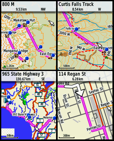
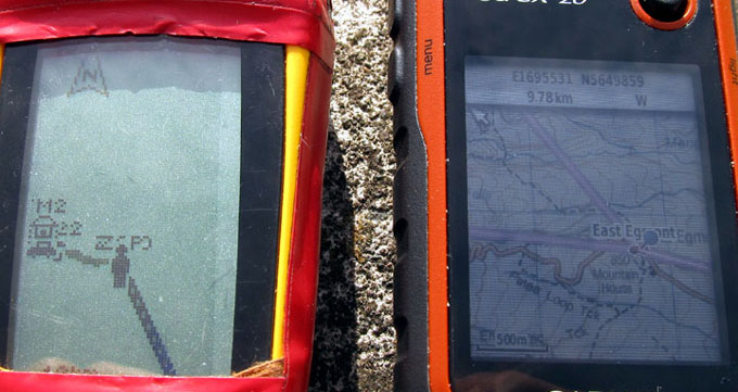
Mr Purple's topo top, OpenGps routable bottom
Three Months On Addendum 2
After walking over 500km with the Etrex 20 doing amateur mapping/surveying, here some further observations.
There are some radical inconsistencys in the UI, that often lead you to think that the firmware is buggy. In general these turn out to be quirks rather than bugs.
1. Click and hold the OK button, marks a waypoint. However you must click Done to save it. If you then go to edit it, the Done button is gone, and any changes you make are saved as you make them. Inconsistent, bad UI design.
2. If you you want to make an averaged waypoint using the OK hold shortcut you get a ridicuous UI experience as follows: Click and hold OK, click left menu, averaged waypoint, bypass the nag that you already did it recently (which you didnt), Save, Done, Done. If you neglect the final done(s), your waypoint will be lost. I wasted hours until i figured this out.
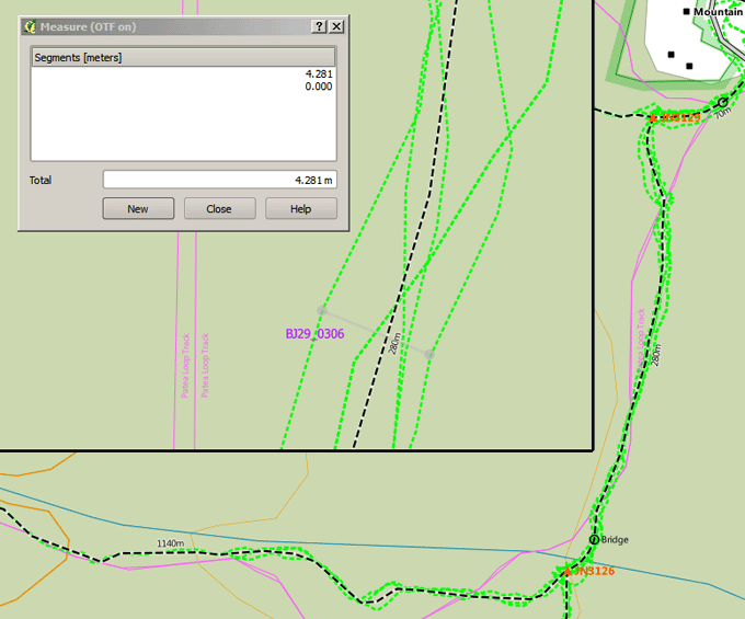
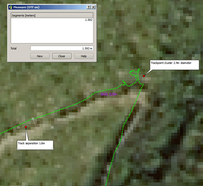
3. Waypoint averaging works in a way that i dont understand. If you download the trackpoints for the duration of the averaging, the average is no where near the logical centroid, or the trackpoint average as calcualted by QGIS. I have basically given up using it, and just set trackpoint collection to 2s interval, and use the trackpoint cluster as a guide.
4. Trackpoint collection. Theres a range of issues with this. The limit is still 10K points. At 2s intervals thats around 4 hours, not enough to get you through the day. Something nasty happens when the tracklog memory gets full. It auto archives well enough, but the trackpoint appearance on screen beyond that time, is only a small tail, that follows you around. I think this is an actual bona fide bug.
5. Garmin have no bug tracking system that the public can use, and this just tells me that they maybe dont care a heck a lot. The online contact form was broken on both occasions i tried to use it.
6. In general the trackpoint accuracy is really a major improvement over anything we have seen to date. Above the bushline i generally get 2m accuracy, when compared to the 0.4m orthophotography (+/-2.5m@90%), or when doing (multiple) back tracks. Under tree cover this drops to 5m, and if raining to 8m. Couldnt be happier with those results.
7. Basecamp liberation, haleluyah. Connect via usb, copy the tracks and waypoints from the gpx folder and open them in QGIS. Save a point shapefile as GPX, call it anything you want and copy to the Etrex's GPX folder. Joy Joy. Happiness at last.
8. Unique naming for waypoints is weird. Sometimes its enforced, sometimes it isnt.
9. The map cursor, zoom. I dont like it. Weve come to know and understand web slippy maps that zoom from the map center, not the cursor. On the etrex when ever i scroll to something, the cursor ends up near the screen edge, then zoom in takes you far from where you wanted to be. I do it every time, yikes. Ok so QGIS and AUTOCAD both zoom from the mouse position. Thats different than with a cursor thats much harder to move. I havent thought through the implications but it would be worth looking at.
10. What do i now think about the click stick position? Well to be fair there is now no longer a map in my right hand. So i find myself alternating, using the device with both hands, and, reaching across with my left thumb. Pretty sure the latter predominates. About all we can say there is that the lefties among us can go celebrate... Or, what about the middle?
11. I take back everything i said about the rounded back. That thing sits in your hand better than a baby bird.
12. Forget custom rasters. Mr Purples topomap ROCKS!
Heavy forest cover
Alpine country
2016-06-07
www.zoneblue.nz/cms/page.php?view=etrex-20-review


